
Summery
Organisational Impact
Moved the initiative from a broad Travel Money Card concept toward a defined MVP/MLP proposition.
Created a shared end-to-end experience across pre-trip, on-trip and post-trip, rather than treating the card as an isolated payments feature.
Established a research-led product development model, instead of validating a finished proposition at the end.
Created clearer prioritisation between hygiene and differentiating capabilities, helping teams focus investment on features capable of creating distinctive customer value.
Turned customer evidence into explicit product decisions, contextualising payment guidance and repositioning rewards.
Aligned Design, Product, Research and the FX domain around a coherent customer proposition
Created a reusable product direction and prototype providing a stronger foundation for subsequent MVP definition and technical planning.
Role in the work:
-
I helped lead the product and experience direction for the Travel Money Card within Booking.com FinTech, working across Design, Product, Research and the FX team.
-
My focus was on turning a broad financial proposition into a coherent customer experience.
-
I worked closely with the team across the product lifecycle: framing the customer problem, establishing the end-to-end experience, using research to challenge assumptions, reviewing design iterations and helping translate what we learned into the MVP direction.
-
A key part of my role was ensuring that we weren't simply adding features to a card.
Commercial Impact
-
Defined a differentiated fintech proposition designed to extend Booking.com’s relationship with customers beyond booking and into travel spending.
-
Identified new potential revenue and engagement levers across card usage, travel spending, rewards and repeat Booking.com purchases.
-
Increased confidence in MVP investment decisions by separating expected financial hygiene features from features customers perceived as differentiated.
-
Reduced product-investment risk through iterative customer testing before committing engineering resources to a broader proposition.
-
Identified Travel Credits as more attractive than restrictive vouchers, creating a potential mechanism to return value into the Booking.com ecosystem.
-
Validated willingness to engage with tiered financial benefits, while identifying that the value needed to be meaningful enough to influence customer behaviour.
The challenge
How might Booking.com earn a place alongside customers' existing financial products?
Earlier research had identified an opportunity for a Booking.com Travel Money Card and established a customer journey spanning pre-trip, on-trip and post-trip. But having a card wasn't enough.Customers already expected the fundamentals from any financial product: the ability to load money, make payments, view transactions and understand their balance.
The real challenge was determining what Booking.com could add that customers couldn't already get from their bank or another fintech product. Three potential differentiators emerged:
-
Travel budgeting — helping customers understand how much money they might need.
-
Local payment guidance — helping travellers understand how money works at their destination.
-
Travel rewards — connecting everyday trip spending back into the Booking.com ecosystem.
Our job was to determine which ideas genuinely created customer value—and how they should work.
Designing around the trip, not the card
We started by framing the experience around how customers' financial needs change throughout a journey. Instead of designing a financial dashboard and fitting travel around it, we designed around the changing context of the traveller.
Before the trip
Help me plan.
How much money will I need?
What do things cost where I'm going?
How much should I load onto the card?
During the trip
Help me stay in control.
How much money do I have left?
What have I spent?
Do I need to add more money?
How should I pay locally?
After the trip
Help me understand.
What did the trip actually cost?
Where did my money go?
What can I learn for my next trip?
This became the foundation for the experience.
Before the trip

During the trip

After the trip

Designing through research
We used research as a continuous design tool rather than a final validation step, working through rapid cycles of explore → prototype → test → learn → iterate. Concepts were deliberately tested at increasing levels of fidelity: early rounds focused on understanding customer mental models, behaviours and information architecture, while later rounds introduced more detailed interactions and product experiences. Each cycle informed the next, allowing us to progressively refine the proposition and make product decisions based on customer evidence rather than assumptions.


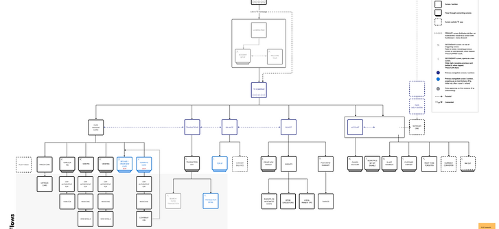
Day 1 designs: Testing different mental models
We first wanted to test out how people thought about budgeting, giving three different potential mental models as examples.

Day 2 designs: Developing the mental models
The ‘Top down’ approach was developed further, with added customisation ability to drill down into the suggested overall budgets.

Day 3 designs: Testing customisations
We developed Idea 1 from Day 2 further, now putting it into a more app-like design in Figma and providing more customisation options.

Day 4 designs: Understanding anchor points
The designs from Day 3 were developed further in terms of look and feel for Day 4, with greater emphasis now given to contextualising the budget estimates.

Day 5 designs: Testing the level of specificity needed
Knowing that people needed anchor points to help them customise and trust the overall budget, we now gave even more detail around how much things cost, and what types of things people would be getting for each budget option.

Day 6 designs: Final touches
Having got positive feedback on the anchor points and customisation ability on most of the categories, we made final adjustments to the Activities category.

Key Trade-offs
Manual budgeting → Smart recommendations
Rather than asking travellers to build a budget from scratch, we provided recommended starting points based on the trip, while allowing customers to adjust the assumptions to match how they travel
Automation → Customer control
Customers valued intelligent recommendations but wanted to understand and modify them. We balanced automation with transparency, making the logic behind recommendations visible and editable.
Detailed dashboards → Simple by default
Testing showed that information-heavy dashboards created unnecessary complexity. We prioritised balance, transactions and essential actions, with deeper spending insights available when customers wanted them.
Budget tracking → Balance awareness
Travellers wanted help budgeting before a trip but didn't want to constantly track themselves against that budget while away. We shifted the on-trip experience toward helping customers understand what they had spent and whether they had enough money left.
Generic advice → Contextual travel guidance
Generic card instructions and travel checklists felt patronising. We focused instead on useful, destination-specific guidance such as tipping, ATMs, currency conversion and local payment behaviour.
Frequent notifications → Actionable nudges
Customers didn't want unnecessary financial notifications interrupting their holiday. We prioritised timely messages that helped them take an immediate action, such as topping up when their balance was running low.
Restrictive vouchers → Flexible Travel Credits
Vouchers could offer greater value but introduced restrictions around where and when they could be used. Customers generally preferred Travel Credits because they offered greater flexibility and fewer constraints.
Rewards-led proposition → Travel-led differentiation
Rewards added value but weren't compelling enough to define the product. We focused differentiation on combining expected fintech capabilities with Booking.com's travel context, particularly destination-aware budgeting and local insights.
Frequent notifications → Actionable nudges
Customers didn't want unnecessary financial notifications interrupting their holiday. We prioritised timely messages that helped them take an immediate action, such as topping up when their balance was running low.
The resulting experience
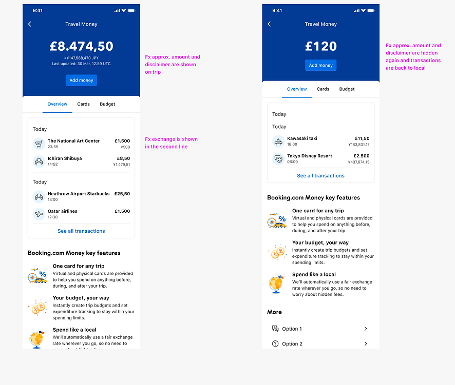
The research helped us converge on an end-to-end Travel Money experience built around three moments. Pre Trip, In Trip and Post trip experiences
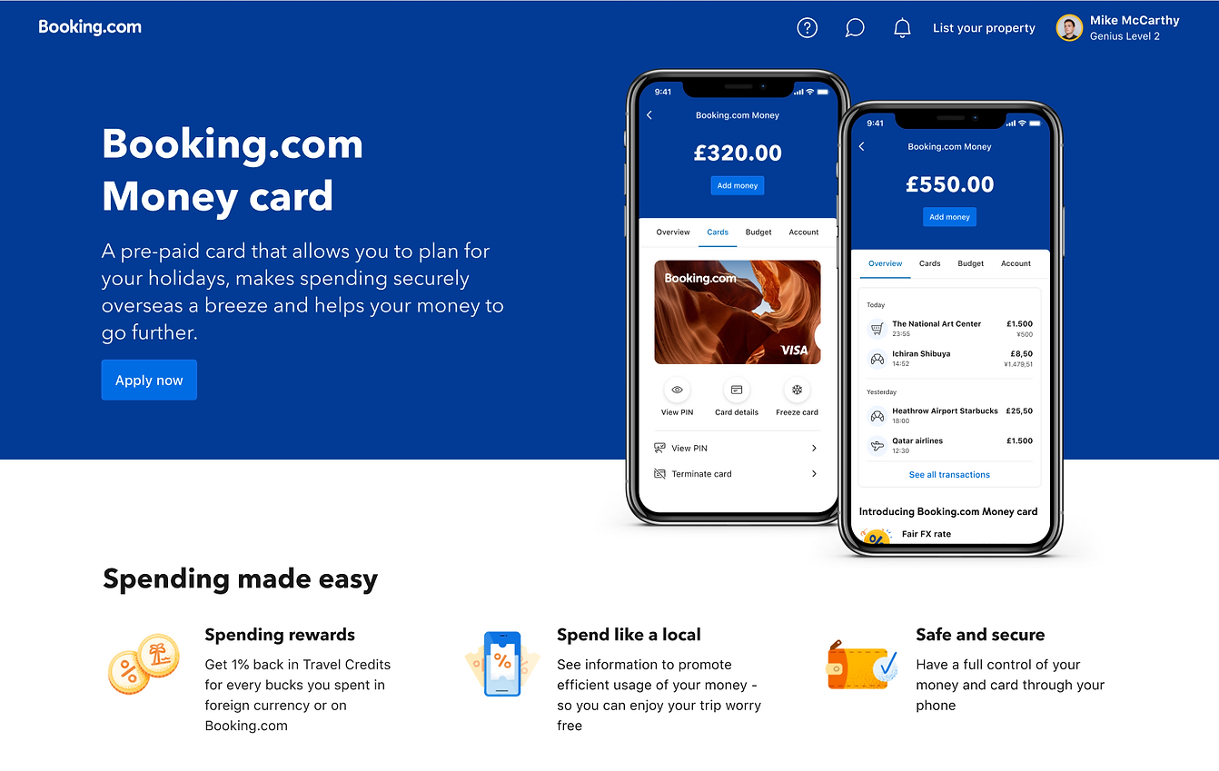
PRE-TRIP
Plan
Receive a destination-aware estimate of how much spending money you might need.
Understand
Use real-world local costs to understand what that budget means.
Personalise
Adjust food, transport, activities and other assumptions around the way you travel.
Fund
Load money onto your Travel Money Card.


ON-TRIP
Spend
Use the card for everyday travel spending.
Stay in control
Understand your balance and recent transactions without constantly managing a budget.
Choose your guidance
Configure alerts and access deeper spending information when needed.
Act like a local
Access contextual payment information about your destination.

POST-TRIP
Understand
See what the trip actually cost.
Learn
Review spending patterns and use them to inform future trips.
Earn
Receive relevant financial and travel benefits connected to Booking.com.
lessons learned
-
Context can be a stronger differentiator than functionality.
Many of the financial capabilities customers expected were already available elsewhere.The opportunity wasn't simply to add more banking functionality. It was to combine financial capabilities with Booking.com's understanding of where customers were going, when they were travelling and what they were likely to need when they got there.
-
Simplicity changes with context.
Before travelling, customers wanted information to help them make decisions.During the trip, they wanted significantly less.Designing the same financial experience across both contexts would have ignored how customer behaviour changes.
-
Research is most valuable when it changes the product.
Some of our strongest decisions came from ideas customers rejected. We removed complexity, reduced information, changed the timing of interventions and repositioned features when the evidence challenged our assumptions. The goal wasn't to validate our design.It was to find the right product.
From a travel card to a financial companion for the trip. We started by asking what features should exist in a Booking.com Travel Money Card. We ended with a more fundamental understanding of the role the product could play.
-
Before the trip: help me plan.
-
During the trip: help me stay in control.
-
After the trip: help me understand.
The opportunity wasn't simply to help customers spend money abroad. It was to help them feel more confident about money throughout their journey.